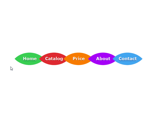
Daha önce Blogger İçin Css3 ve jQuery İle Hazırlanmış Menü Tasarımı adlı bir konu paylaşmıştım. Bu sefer yine css kodları iledüzenlenmiş yaprak görünümlü ve hareketli bir menü tasarımını paylaşacağım.
HTML KODLARI:
Bu kodları yeni bir gadget içine ekleyerek yapabilirsiniz.
<nav>
<ul class="top-menu">
<li><a href=#>Home</a><div class="menu-item" id="home"></div></li>
<li><a href=#>Catalog</a><div class="menu-item" id="cataloge"></div></li>
<li><a href=#>Price</a><div class="menu-item" id="price"></div></li>
<li><a href=#>About</a><div class="menu-item" id="about"></div></li>
<li><a href=#>Contact</a><div class="menu-item" id="contact"></div></li>
</ul>
</nav>
# gösterilmiş yerlere bağlantı adresleri yazılacak
Home, catalog gibi alanları Türkçeleştirip dilediğiniz gibi kullanabilirsiniz
CSS KODLARI:
<style type="text/css">
nav {
        width: 960px;
        height: 100px;
        margin: 120px auto;
        text-align: center;
}
.top-menu li {
        display: inline-block;
        text-align: center;
        margin: 30px 5px;
        position: relative;
        -webkit-transition: all 0.3s ease;
        -moz-transition: all 0.3s ease;
        -o-transition: all 0.3s ease;
}
.top-menu li:hover {
        margin: 30px 20px;
}
.top-menu li:active {
        margin: 30px 33px;
}
.top-menu li a  {
        width: 100px;
        height: 100px;
        z-index: 9999;
        position: absolute;
        top: 35px;
        font-weight: bold;
        display: block;
        text-decoration: none;
        font-size: 20px;
        color: #fff;
        text-shadow: 0px 1px 1px rgba(0,0,0,0.4), 0px 4px 6px rgba(0,0,0,0.1), 0px 9px 11px rgba(0,0,0,0.1);
        -webkit-transition: all 0.1s linear;
        -moz-transition: all 0.1s linear;
        -o-transition: all 0.1s linear;
}
.top-menu li:active a {
        font-size: 26px;
        top: 30px;
        text-shadow: none;
}
.top-menu li div.menu-item {
        width: 100px;
        height: 100px;
        display: block;
        -webkit-transition: all 0.2s ease;
        -moz-transition: all 0.2s ease;
        -o-transition: all 0.2s ease;
        -webkit-border-top-left-radius: 100px;
        -webkit-border-bottom-right-radius: 100px;
        -moz-border-radius-topleft: 100px;
        -moz-border-radius-bottomright: 100px;
        border-top-left-radius: 100px;
        border-bottom-right-radius: 100px;
        -webkit-transform: rotate(45deg);
        -moz-transform: rotate(45deg);
        -o-transform: rotate(45deg);
}
.top-menu li:hover div.menu-item{
        -webkit-border-top-left-radius: 80px;
        -webkit-border-bottom-right-radius: 80px;
        -moz-border-radius-topleft: 80px;
        -moz-border-radius-bottomright: 80px;
        border-top-left-radius: 80px;
        border-bottom-right-radius: 80px;
                -webkit-transform: rotate(225deg);
        -moz-transform: rotate(225deg);
        -o-transform: rotate(225deg);
}
.top-menu li:active div.menu-item{
        -webkit-border-top-left-radius: 50px;
        -webkit-border-bottom-right-radius: 50px;
        -moz-border-radius-topleft: 50px;
        -moz-border-radius-bottomright: 50px;
        border-top-left-radius: 50px;
        border-bottom-right-radius: 50px;
}
#home { background: #41D05F; }
#cataloge { background: #E42B2B;}
#price { background: #ff8400; }
#about { background: #a800ff; }
#contact { background: #49a7f3; }
</style>
]]></b:skin>
Milan Tomic
Hi. I’m Designer of Blog Magic. I’m CEO/Founder of ThemeXpose. I’m Creative Art Director, Web Designer, UI/UX Designer, Interaction Designer, Industrial Designer, Web Developer, Business Enthusiast, StartUp Enthusiast, Speaker, Writer and Photographer. Inspired to make things looks better.


0 yorum:
Yorum Gönder